
HELPR BROWSER EXTENSION
A Snapshot
The challenge: We wanted to know how we could help freelancers become more successful. The problem was finding how freelancers define success.
The Objective: Our overall objective was to research, strategize and design a product that would help freelancers work more efficiently and stay organized in a way that is easy and accessible.
My role: Within my team, my primary focuses were: UX Research, Prototyping and Developing a Sales Pitch to Investors. I created interview guides, conducted user interviews and worked with my team for all affinity mapping, user personas and journeys, user flows, wireframing and prototyping.
The Solution: An extension for freelancers that allows them to streamline their tasks across multiple platforms into one hub that can be organized by project. The extension was developed to act as an independent contractor’s virtual assistant. Once downloaded, HELPR is able to sync to apps such as Zoom, Figma, Miro, Canva, and email services in order to provide freelancers with an interactive one stop overview of all the tasks they have to complete.
The Outcomes: You can view the complete sales pitch presentation for our prototype here.

overview


.png)
conceptualize
design
empathize
interview guide
user interviews
competitive analysis
affinity mapping
user persona
user journeys
user flows
style guide
wireframes and prototypes
at a glance
The Methodology: There were three phases of this project: empathize, conceptualize, and design.
the team: HELPR was researched, conceptualized, and designed by a team of 3 designers. Our team received feedback throughout the process from 6 other designers whom we have an ongoing professional working relationship with.
The Tools: This project was completed using Google Applications (Forms, Docs, Sheets), Miro, Figma, InDesign, and Canva. These applications were used to: facilitate research, gain peer feedback, develop wireframes, produce dynamic prototypes, and create a comprehensive sales pitch, respectively.
The Timeline: This project took 8 weeks to complete in total.
The deliverables: 30 web screens 5 mobile screens.

empathize
research analysis

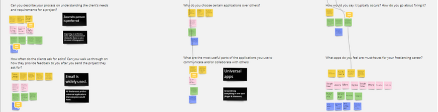
AT THE BEGINNING of this project, my team lacked understanding of freelancer expectations. In order to combat this, there were 3 key questions we had at the beginning of this project that, once answered, would help us empathize with our users better. Those questions were: what are current frustrations and pain points?; what did they really want?; and what did they really need?
The Research: In order to better understand these questions, we dove into a 3 week research phase that consisted of 2 rounds of interviews with 7 participants per round. We created interview guides that allowed us to isolate user pain points so we could better understand how to help them succeed.
Secondary Research: During this phase, we investigated public forums such as facebook groups and conducted an in depth competitor analysis to help us understand what the current product landscape was for our target demographic to choose from.
key takeaways
we learned that:
• Lack of streamlining was contributing to miscommunication
• Competitor products were inconvenient
• Calendar, Emails, and Text Apps were used by all participants interviewed

conceptualize
user personas and journeys

The user persona was developed in order to gain perspective similar to our target user, understand where pain points arise in workflow, and empathize with a demographic outside of our personal experience and expertise.
the user journeys indicated that pain points our participants identified showed up most during administrative tasks such as: volleying back and forth between sites to collect deliverables; communicating between clients, collaborators, and stakeholders via different channels; and organizing projects with so many moving parts on a timeline
key takeaways
we learned that freelancers feel most successful when:
-
communication between themselves, clients, and collaborators is efficient
-
they don't have to bounce back and forth between sites
-
they're able to focus less on administrative tasks and more on their projects
.png)
design
Style Guide

typography

color palette
components


Initial sketches

lofi wireframes


high fidelity wireframes
Flow One: Check Notification for a Project

.png)
flow two: Create a New Project


Flow three: Create an Event for a Project


The three user flows we created were: checking a new message notification; creating a new project; and creating an event within a project, both manually and automatically. These were used as guidelines when creating screens. We focused on the main functionalities of the extension that alleviated pain points we found freelancers faced.
The Style GuidE: We chose Roboto since it is a highly legible font. We used deep blues to convey reliability. Icons that were widely used and understood were designed and selected.
Based off of this style guide, our user flows, wireframes, and all of the research and strategizing we had completed we were able to complete our browser extension: HELPR.
key takeaways
we learned the best strategies for solving our initial problem based on our research findings.
Some of these design highlights and features we were most proud of consisted of:
-
A 2 panel design synching normal email functionality to the side extension panel
-
Automation when assigning new messages and notifications to projects
-
Organization by messages, tasks, and events

conclusion
what we did well
_gif.gif)
The challenge was to create a tool to help freelancers be more successful by helping them streamline and organize tasks
the solution we developed was successful for many reasons. We were able to spend ample time on design iterations, and were able to get user feedback along the way to ensure we were creating something that satiated their needs. We created an extension (rather than an app or other program), so users did not have to learn a new program. We kept it simple and straightforward in order to maximize success rate. We ensured it worked with programs our users frequented so it operated as an assistant, rather than an extra step.
what we will do better in the future
in retrospect our research phase was much longer than necessary. If our interview guide was more comprehensive to begin with, we could have had less rounds of interviews at the beginning and in turn had more time to design and conduct user research based on the screens we developed. Additionally, our sample size for users, while diverse, was relatively small.
Moving forward spending more time upfront developing a thorough interview guide with clear objectives and less room for leading questions will be preferred. Spacing research out throughout the duration of the project allows for more checks throughout the design process to ensure user experience stays positive.